Kaffe 2014 – The Colourful World of Kaffe Fassett (Visited: 18. October, 2014).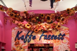
The exhibition celebrates Kaffe Fassett fifty years working as an artist and colourist. It has over one hundred work of textile art, displayed in a very colourful and dramatic way (video).
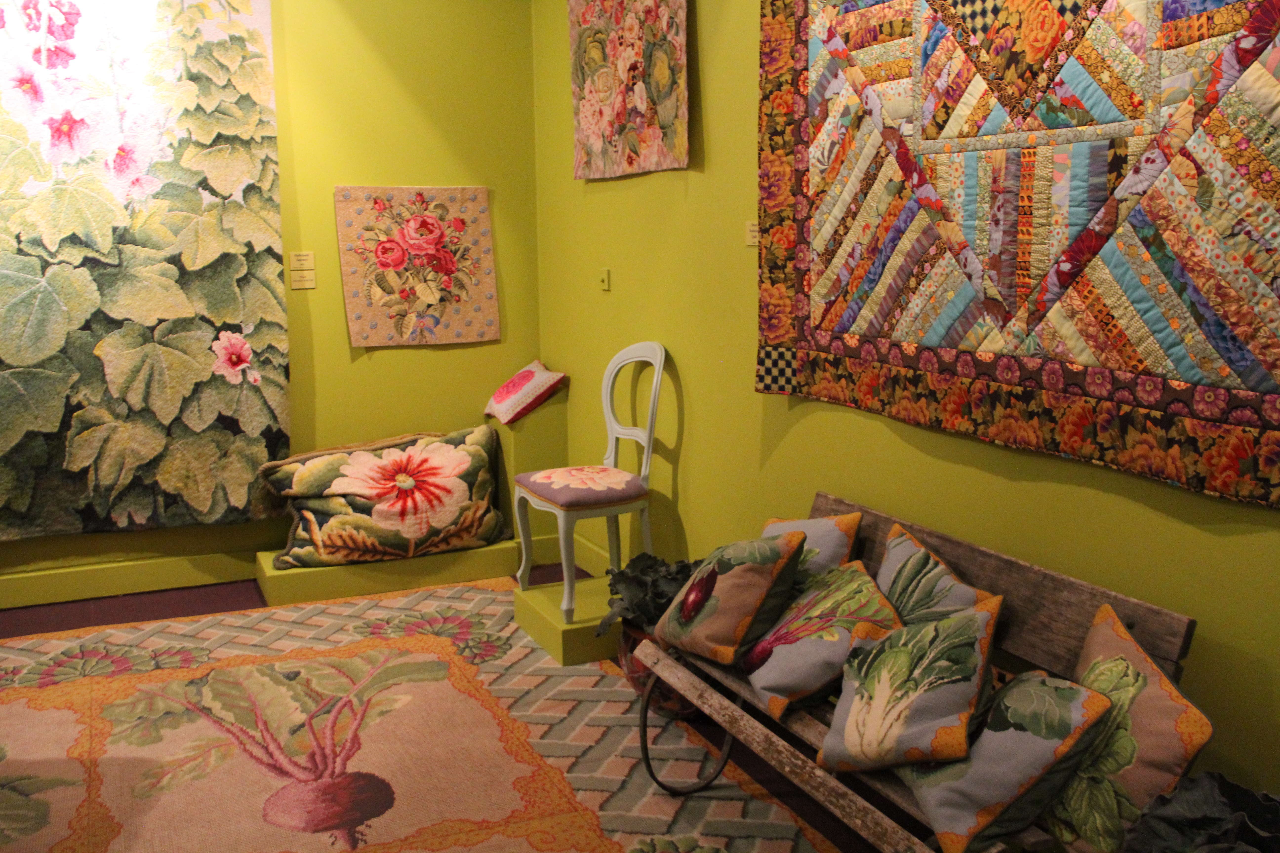
General ambience of the exhibition:
- Theme: Colour
- Organization: The showroom is linked to Claverton Manor which holds the American Museum. Its in the main showroom as well as a back room, with the entrance through a mirror tunnel. It has a representation of Kaffe´s workplace, but also a wall of interesting quotes from the designer through the years – “My first lesson about design – when in doubt, try it!” (1985), “Good designing follows no rules: remaining open to the unexpected is paramount“, (1991). The lighting was a bit strange, but I think that was done on purpose to give this overpowering splash and mix of colours. It was displayed as a storyboard going from one colour theme to the next.
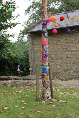
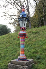
- Visually stimulating and interesting: Yes, very powerful and interesting. Amazing colour combinations but also the way Kaffe Fassett uses texture is fascinating jet liberating. I got lot of ideas, but the exhibition is also a bit over the top, so it was good to walk out into the gardens of the Manor house, regenerate and then go back inside to look at it in more detail!

The following three exhibits caught my interest.
HATS


These are very simple crochet hats, but have been made unique by adding on buttons and beads in various colour combinations. Thought the use of colour was amazing, but also the form is very simple jet dramatic. Love the way he uses the shapes of the beads as well as the colour to get an individual look for each hat.
INSPIRATION
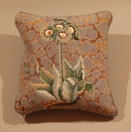

I call this inspiration as it shows how Kaffe Fassett takes an inspiration and brings it to life through design. I can see the form from the plate. Amazing how he used this simple form playing with colour to get a subtle, jet striking background.
SWEATER
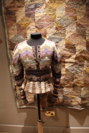
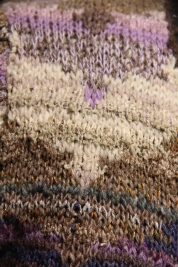
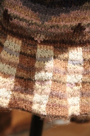
This item caught my attention (seen it in books), both for colour combination but also the use of textured yarn to get the desired colour/texture outcome.
Conclusion:
What an eye opener, the use of colour and texture are amazing. Also loved the use of colour outside the gallery, simple but clever idea of bringing a little bit of a colour into life.